Monday, 5 December 2016

Shot Composition

Monday 5th December 
L/O-To understand the basic rules of shot composition.


Rule of Thirds and Leading lines:


The rule of thirds is what makes certain things stand out in pictures. It uses guidelines like in the second picture. For example with the man with his bike, he is in the middle third and where the lines cross over on the right side, his head and feet are there.


Pictures that don't use the rule of thirds.


You can tell these don't because there is no actual focus or they are right in the middle.


Photographing people:

  • Looking room
  • Headroom
  • Eyelevel


Peer Assessed by: Katlyn 
WWW- You gave a good amount of head room, and you can see both you eyes.
NTT- Use yourself instead of someone else, make sure the looking room is more to the side.

Think about:
  • Camera positioning/perspective
  • Texture&Pattern
  • Leading lines
  • Backround


This is a well composed picture because it uses leading lines to lead to the girl. The camera angle is also good because its around her height instead of looking down on her. Its also focused more on the background and its faded at the front.


This is also a nicely composed picture because it uses the rule of thirds. It has also got a blurred background to really make you focus on the flowers. Although, only a few of the flowers are actually properly focused.


Monday, 28 November 2016

Final Magazine cover


28/11/16


Peer Assessed by - Freya Piper

WWW - The layout of the magazine matches other magazines of this genre and you have stuck to your colour scheme.

NTT - Maybe next time you could make the main image bigger to make it more noticeable.


Self assessment:
WWW: The layout is quite like my style guide.

NTT: Make it look more like a magazine cover, maybe a different font.

Mag Cover Planning

Magazine Cover Planning:

L/O: To Create an effective magazine cover using appropriate codes and conventions.
  • Title
  • Main Image
  • Main Coverline
  • Coverlines
  • Small Details- Barcodes/Date
  • Colour Palette

Style Guide:


Title: Halftime
Colour Palette: Red/White/Black
Main Image: Picture of me kicking the ball
Small Details needed: Barcode/Price/Date


Typography:

28/11/16
Look at your style guide and answer the following questions:
  1. There are four different styles of font.
  2. The coverlines are made to look different by using different colours to separate them. Red to catch the attention then black to tell you some more extra detail. The sizes are different and some are bold. the font stays the same.
  3. The Coverlines are block caps and sentence case.
  4.  The Coverline font is angular as opposed to rounded as its a more masculine magazine cover.
  5. Most of the coverlines are arranged around the main image but some go over or under the person.


Monday, 14 November 2016

Magazine Front Covers

Magazine Front Covers

L.O: To identify and use genre conventions.
  • Masthead: The title on the front cover, big writing usually, attracts readers attention, identifys the brand.
  • Dateline: Where the date of when the magazine was issued is written, usually under the masthead.
  • Main Image: A big picture to grab peoples attention, takes up nearly the whole page.
  • Coverlines: The writing you read to see if you would be interested in that magazine, the article titles.
  • Main cover lines: The cover line that has the largest writing, normally the biggest story, can link to the main image.
  • Barcode/Price: Where it says how much the magazine costs and where they can scan it.
  • Tagline: Tells you a little bit more information of what the magazine is about, this is also to see if the magazine interests the reader.
  • Quote preview: Like a sneak preview, a quote from an article in the magazine.


Codes and Conventions


  • The main image is usually a mid shot or full length shot of the footballer.
  • The masthead normally has something do to with football in it like soccer or kickoff.
  • There is normally quite bright colours to make it stand out, I can see most of them have red but they probably have the colours of the team.
  • Most have quite a few cover lines.
All of them have datelines above the masthead.

Style Guide


Monday, 17 October 2016

Creative Techniques in Photoshop

Creative Techniques in Photoshop.

Colour Popping:


Gradient Masks:


Liquifying:


Blend Modes:


Layer masks:


Text Clipping:


Quick Selection Tool:

Monday, 10 October 2016

Introduction to Photoshop

Introduction to Photoshop:

We used Photoshop to create a zombie face using layers, the lasso tool and image adjustments. Below is my first attempt.


Self assessment:

WWW: The head and the mouth were both matched to fit in with my face shape.
NTT: Make it look a bit more realistic and add more features to it.

Second Attempt:


WWW: The features fit to my face good.
NTT: Make the bare skin that was showing a more appropriate colour.

Monday, 3 October 2016

IMovie Trailer Project


I used the Titanic Trailer. I Changed it from a Romance genre to a Horror genre.


Tuesday, 27 September 2016

The Key Concepts of an advert.

Key Concepts of an Advert:

L/O: To identify and apply the key concepts to an advert.

I am doing the Nike: Unlimited you Advert.
https://www.youtube.com/watch?v=VEX7KhIA3bU

What Media language has been used?
The Advert uses visual language which means its been filmed. It has been specifically chosen to make a series of effects on the viewer. It also uses verbal language as it has a man talking throughout the entire thing explaining whats happening. The advert uses semiotics which are signs or symbols which in this case is the nike tick. Most of the people in the video is wearing nike clothes or using nike equipment. This helps to sell and advertise the brand.

Camera Shots:

The Advert mostly uses long shots on the people so it can show them doing their sport fullyand it also shows off their nike clothes from the headband to the trainers. It sometimes uses mid shot so it shows from above aroung their waist and sometimes, for example for the footballers it uses a cut in shot that only shows their legs and feet.

Use of voiceover, sound and music:

The voiceover for this video is a man who is talking to the characters and the audience. Its actor Oscar Issac from star wars: the force awakens. He is quite a witty sounding man so it pulls you more into listening and watching the video. The video uses diegetic and non diegetic sound which means that by diegetic,it says stuff that the characters can hear like when the man is speaking to the athletes and non diegetics is when the characters cant hear anything so like near the end when everything gets really fast paced and there is music in the backround.

Use of Setting/Celebrities/Colour:

The advert uses different settings to advertise all sports, basketball court, tennis court, football pitch, swimming pool etc. Nike also uses Famous athletes/celebrities like Mo Farah, Serena Williams, Kevin Durant and Neymar. Finally, all the way through, the advert has bright colours to attract attention until the end where it just has a black screen with white writing to make it even more effective.

Placement of people/objects/text:

The placement of people is basically atleast one person in each scene around the ball or just running with the main focus on them. For each sport the objects around are the equipment needed for that specific sport. There is not much text in the advert besides the subtitles of what the actors are saying and the text saying "Just do it" to conclude the Nike advert.

Facial Expressions:

The Facial expession on everyones faces is determination which relates to the advert which is called Unlimited you. Its to say that you can achieve anything if you put your mind to it,

Use of Graphics/CGI/Text

The only use of Graphics in the advert is when the gymnast is going round on the rings and the "Just Do It" sign comes up in text then suddenly the gymnast kicks it and it explodes everywhere. It also has some CGI at the end in the text saying unlimited you.

What Instituition made it?

The Instituition that made the advert is Nike. The goal they are trying to achieve by making the advert is to make more people believe in themselves and do sport. They are saying that if you work hard enough for something you could be the best at it.

Who is the target Audience?

I think the target audience is for everyone that wants to start sport, so all ages. I think this because the voiceover says "all these athletes are terrible now, but they'll all do big things one day." So this is telling people that even if they're bad at sport now, if they keep trying they will be great one day.

How is the Product being represented?

Its not really a product that is being represented, its a brand. The advert suggests that Nike is a sport brand that wants everyone to get more involved in sport and wants to support them. I know this because it says it all in the advert with them trying to say about how all amazing athletes started at the bottom then made it to the top.

Monday, 19 September 2016

Key Concepts

Key Concepts

L/O: To apply the four key concepts to media texts.


  • Media Language: Forms and Conventions.
  • Institutions.
  • Audience.
  • Representation.

Media Language

This covers terms used, how texts are constructed and the messages conveyed. It includes:
  • Camerawork (Cinematography)
  • Soundtrack
  • Mise-en-scene
  • Editing 
Masthead: The bit that says GLAMOUR is the title but is also known as the masthead.

Camera Shot/Main image: The camera shot is  a Close up because the picture starts around her shoulders then up to the top of her head.

Cover lines: The cover lines are the little headings of the storys, for example: The Social Issue.

Use of Colour: The Colour Pallet is blue, yellow, white and black.

Celebrity: Kylie Jenner, she has her own makeup line so she is an appropriate person for a glamour magazine.

Date: There is the Dateline under the Masthead on the right.


Institution: 

Who makes what and for whom.

Audience:

We can define the audience by: Gender, age range, location, hobbies and interests, lifestyle, wealth and class.
This is a print advert aimed at a teenage audience.


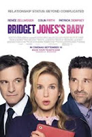
 This is a Film poster aimed at a female adult audience.


This is a game cover aimed at teenage boys.


Representation:

Involves looking at how you see the world and how the world sees you. Uses stereotypes.


RED- In the fourth photo along, top row you can tell the woman is serious just by the way she's looking at the camera and not smiling. 

CRAZY EYES- The fifth one along, top row, this is the crazy/funny character. you can tell she's the crazy one because of the way her eyes are looking at the camera and she's got food all over her face.

SOPHIA- This is the last one, bottom row. She is the girly one who loves doing hair and makeup. you can tell this because she is in prison yet she has curled hair and full on makeup, stereo typical girly girl. 


Monday, 12 September 2016

What is Media?

Monday 12th September
L/O : To define what media is and how it impacts upon our lives.

Definition: "The main means of mass communication."
Different Types of Media:
  • Blog
  • Text
  • Social Media.
  • Gaming
  • Email
  • Radio Station
  • Newspaper
  • Tv 
  • Magazine
  • Advertising
  • Films
  • Website
Main Purpose of Media is to make money.

Media Influence
Does the Media influence me?
Yes.

How?
Because I see things in my newsfeed that influence me.

Is it powerful?
Yes.

How is it powerful?
Because it makes information go a long way. For example on Facebook, if people keep sharing a post all their friends will share it and then all their friends and so on.

The main purpose of Media is entertainment.
No it isn't, its for the producers to make as much money as possible.

Sites like Facebook, snapchat and twitter make us more antisocial.
I think this is true in one way because people hide away in their rooms on their phone not talking to anyone but on the other hand you do message people on social media sites so that is being social with friends.


Thursday, 8 September 2016

My GCSE Media Blog

Welcome to my Media Blog

Me and Media

My Favourite...
Films: Blended, Love Rosie
Tv Shows: Gilmore Girls
Social Networks: Facebook, Snapchat
Radio Stations: Pirate Fm
Video Games: GTA